Memo
Journaling
Mobile App
Solo
Animations
Designed to be a guided journaling app that help users identify the emotions they feel and the causes of such while being able to express gratitude for positive
Roles:
UI Designer
UX Researcher
Tools:
Figma
Date:
April 2024 – June 2024
Timeline:
12 weeks
Key Features
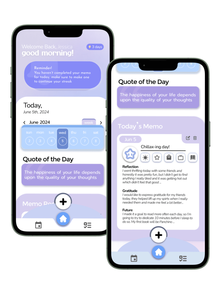
Reminders & Updates
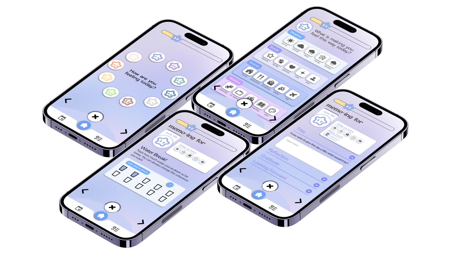
Upon opening the app, past and present journal records are present in a preview form. Alongside a notice to complete a memo, streak component, and daily updates like the quote.

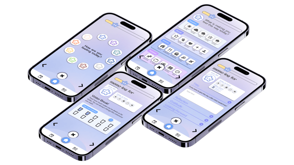
Guiding Questions
To successfully document a day, users can describe their day by selecting icons form, or summarize their day in text form. Allowing each journal entry to be organized and maintain the same format.
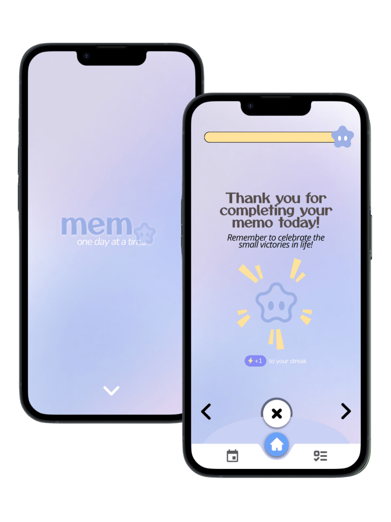
Pleasure Points
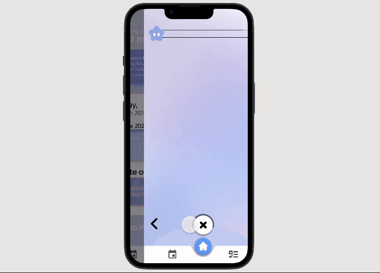
Sometimes even the app should score some gratification points along the way. With micro-interactions in animated form, users feel a sense of ease and accomplishment whenever they open the app or complete a Memo.
A Record of the Day
I’ve tried many different daily journaling apps over time, but none of them really stuck. In the beginning, I would feel extra motivated to use their journaling features, until I’d just forget one day and never really go back to it. After realizing how this is a struggle many encounter, I turned to research in order to understand the pains and needs of their users.
Competitive Analysis
In my app flow analysis of an existing platform, Gratsy, there was only one page that screens all of the app’s features, providing freedom for the user to decide how they may want to use the app. However, it omits the feeling of accomplishment for filling an entry out, or motivation to continuously use the app.

Gratsy‘s Weakness
Limited App Flow
Minimal Animations
Lots of whitespace
Empty satisfaction
I recently lost my 200 day streak on BeReal.
It was quite devastating but I was also quite proud that I was able to maintain a streak for that span of time on an app. At least it was able to provide me with some inspiration for my app design, in which I realized the solution to make sure an app stayed in users’ routine was by creating a streak mechanism and positive feedback loops built into the app.
Starting Off with a Blank Canvas
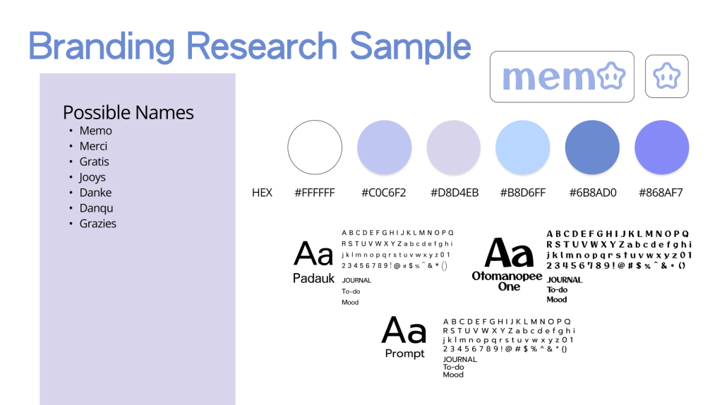
Memo‘s logo draws inspiration from the childhood joy of earning a star for each good deed, designed to evoke a sense of happiness every time a user completes a task in the app.
Accompanied by the brand colors of purple and blue to give off the feeling of calmness and relaxation whenever using the app.
Stepping into the IX Flow

I was able to direct my design direction when approaching the creation of Memo by defining what each button or interaction was supposed to do and look like.
My Goal:
Fluid Animations
Clear App Flow
Increase User Engagement
To the Drawing Board
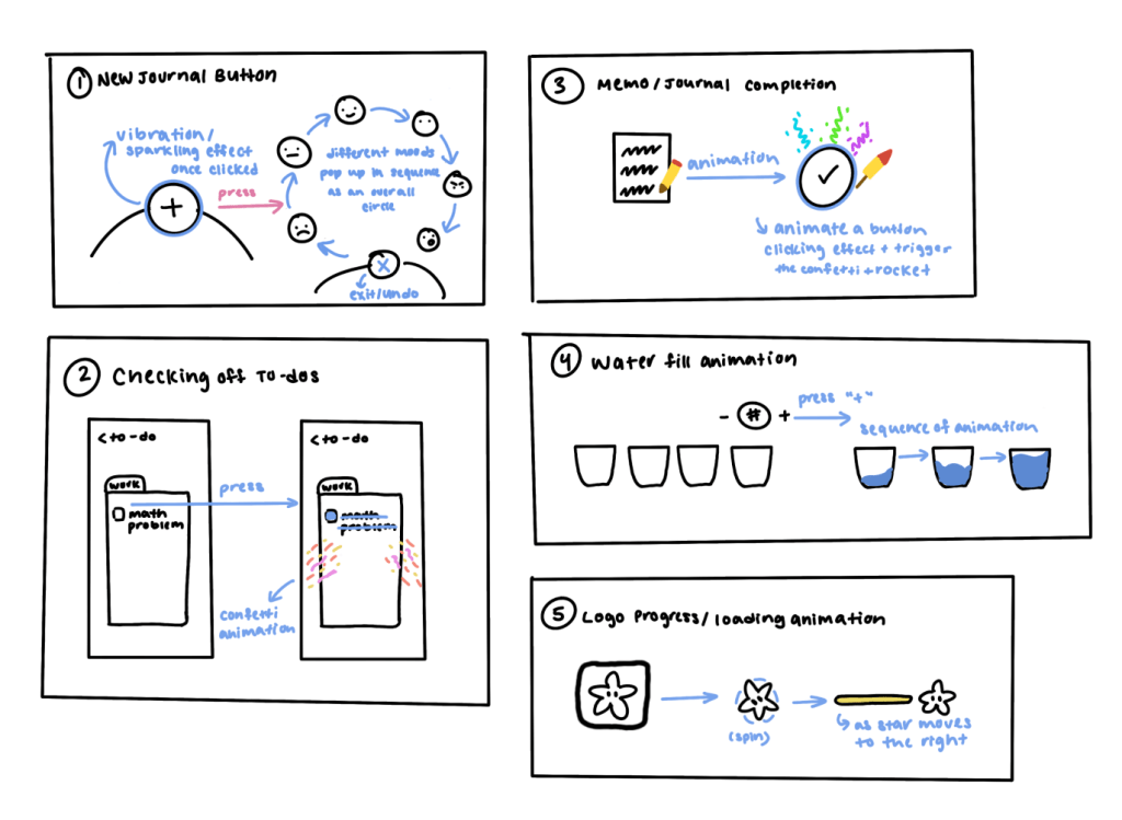
In order to visualize what I wanted to achieve for feedback, I drew out some of the animations that I intended on creating through Figma
Final Touches with Purple
Assisted Guide
In order to help create a sense of routine that a user can integrate into their daily schedule, the journaling method the app takes on provides users with a consistent prompt and sequence format.
Mood Selection
With responsive text for each emoticon selected
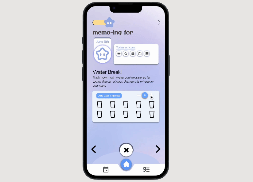
Water Tracker
Filling and draining water animation to replicate reality
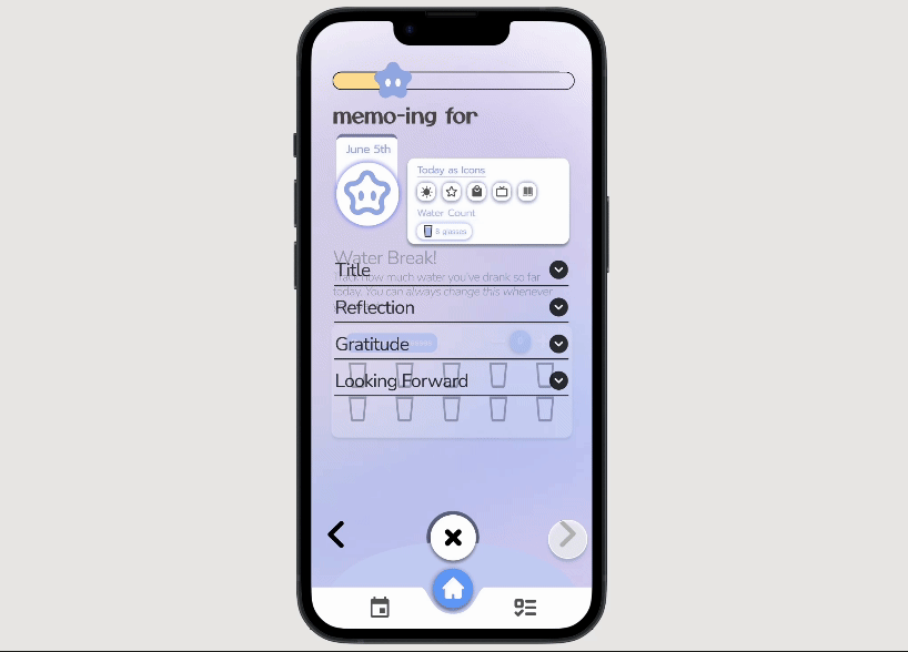
Journaling Prompts
Reflection based questions for guidance
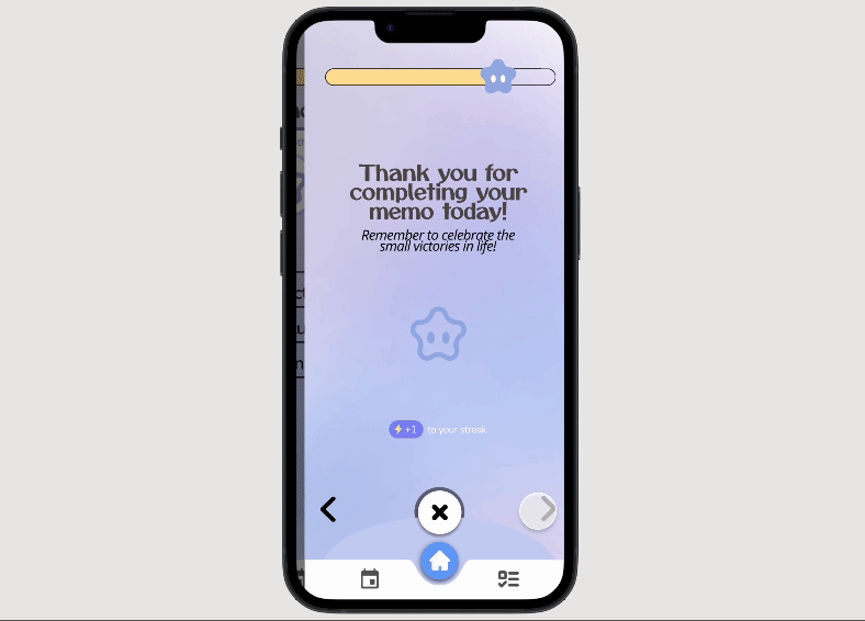
Success Screen!
Designed to give off a sense of accomplishment after an entry is completed
