YU&ME BOOKS
Local Bookstore
SOLO
Website Redesign
Responsive approach
Revamped a bookstore website with intentions of creating better information hierarchy, adding a comprehendible flow between pages, and creating a consistent branding of the website
Roles:
UI Designer
UX Researcher
Tool:
Figma
User Persona
Adobe Illustrator
Date:
Jan 2024 – Mar 2024
Timeline:
12 Weeks
Key Features
Event Preview
By including a preview of the Events page, it creates a flow within the website for the users to follow when they’re on the Homepage, that way they’ll be able to dig deeper into the store’s highlights


Interactive Calendar
Users can see upcoming events in a more orderly and visually comprehendible way in a weekly calendar format
Data Input
These sections that allow users to type and interact with the websites and offering a newsletter option will detect how many people are interested in the store and has gone through the website

Original Website

YU&ME BOOKS is a bookstore located in located in Chinatown, Manhattan that I’ve visited before. I fell in love with their modern academia interior color palette of cyan and orange.
But their homepage is … quite long
That wasn’t the only problem, but I found that their homepage was missing a lot of information and didn’t provide the best insight into special events that YU&ME had to offer if someone were to only look at their homepage. I separated my findings into a pros and cons list to see what is necessary to improve the site.
Pros
- Colorful and consistent graphics
- Interactive photo carousel
- Lots of existing photo and text content
Cons
- Large navigation menu, causes cluttering at the top
- Lots of white spaces or blocks of information on page
- Hard to read text and inconsistent
- Different typography used on each page
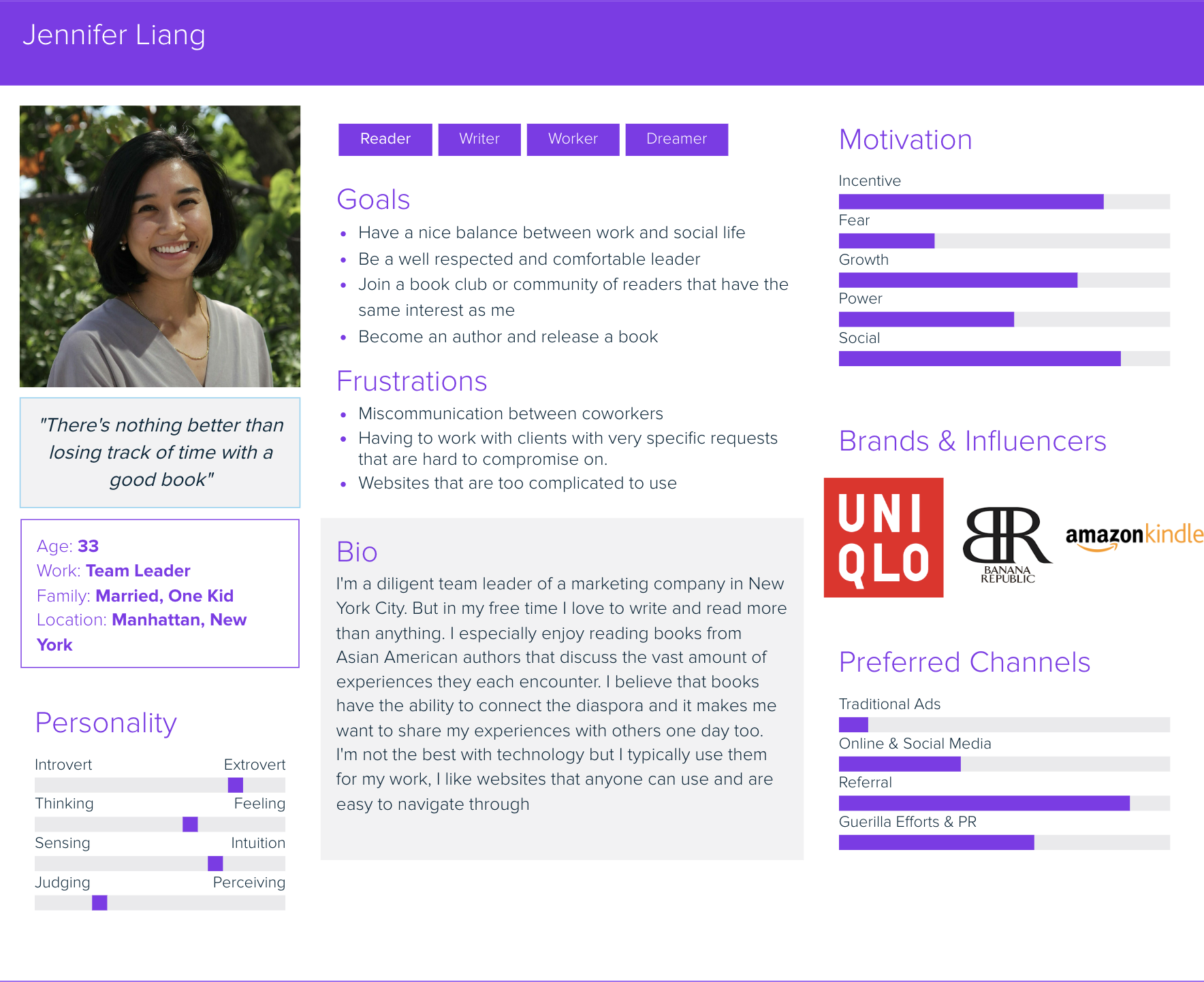
Who is YU&ME BOOKS’ Audience?
By creating a User Persona Map, it helped me understand out what their users are looking for in a bookstore website and laid out their frustrations to prevent any of those from being displayed in my redesign
in order to pinpoint the things I wanted to change I narrowed it down to
3 Design Goals

CONSISTENCY
Creating a consistent color palette and stylization throughout the site. For example, the headers, font, white space

NAVIGATION
Improving the navigation for someone on the site for the first time and making the website sequence more clear

TYPOGRAPHY
Focusing on making the text on the website readable and apply creative use of typography
Starting off with the Atoms

Typography and colors invokes emotions.
Inspired by the use of cyan on the original website, I made sure it would be my primary color for my design. It has a cool sense of modernity, with hints of calmness and creativity woven into its bright tones.
As for the font-type, I felt that sans-serifs have a sleek simplicity, making them ideal for conveying information with clarity and ease.
Onto gray boxes
The wire-framing begins as I started testing out different layouts for the desktop, mobile and tablet screen.
What sections and what information should be on each page? What do users want to access quickly?
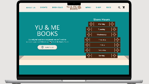
My initial thoughts were of including store hours on the first screen, subpage previews, and call to action buttons

Freshly Published Designs
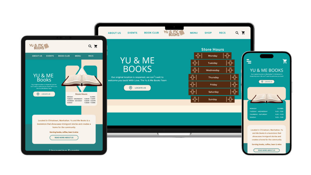
With my original pages, I focused on visual hierarchy and the size, font, and weight differences between certain information on a page. In which the title should be the biggest but also be formatted to be separated from other parts of groupings of text.
Such as the the name of the store above the paragraph text which is then above the button element.

Home Page
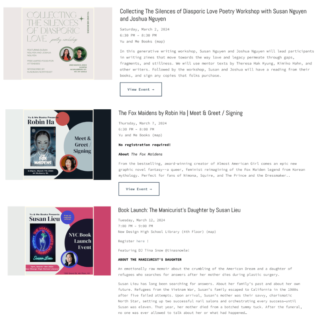
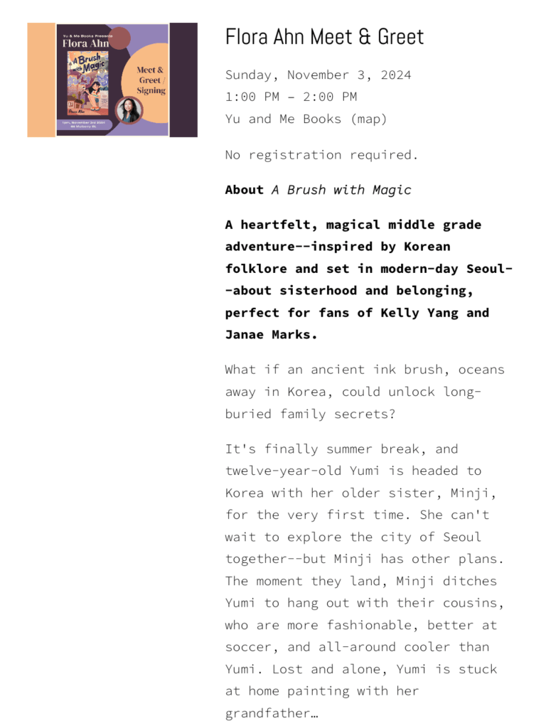
And the title of the book and event above the date, time, and location above the blurb of description for the event

Events Page
My “Events” page was originally composed of clickable text that would bring the users to different weeks of the month and update with the events in a chronologically vertical formatting
Heuristic Review
For a midway evaluation, I asked three users to test the usability of my prototype. User A and User B were fellow college students, while the User C was within the target audience range I envisioned for YU&ME BOOKS

The feedback I received comprised of
Complicated Events Structure
User B said that although they could navigate through my events page, they had trouble comprehending the structure of the “Week 2/3/4” text that I had above the actual dates of the week
Small Inconsistencies
Directly towards the appearance of a bookmark icon for an event that was displayed on the homepage that didn’t exist later on the events detail page created inconsistencies on my page
Issues in Readability
Sometimes a button would be too small, and the font becomes illegible against all the other information displayed on the screen created confusions on what was clickable
Success Screens!
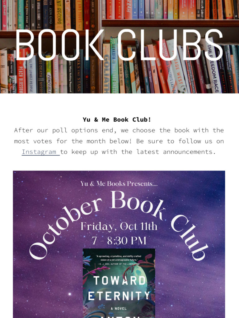
Taking the results from my heuristic evaluations to consideration, I decided to redesign my events page as the appearance of a calendar instead. With this calendar, users can select a date/week and the page will then display a visual of the events for the week in blocks and according to the time on the side of the calendar.
Using the overlay function in Figma, by clicking on an event, a pop up will come up for users to read more information about the event structured with visual hierarchy. The user will be able to click the “X” or the background area to step out of the pop up and go back to viewing other events. And upon clicking the subscribe button, another pop up with come up showing another user input screen for an email and then a success screen upon correctly submitting the form to let the users know the process is complete.
Final Touches
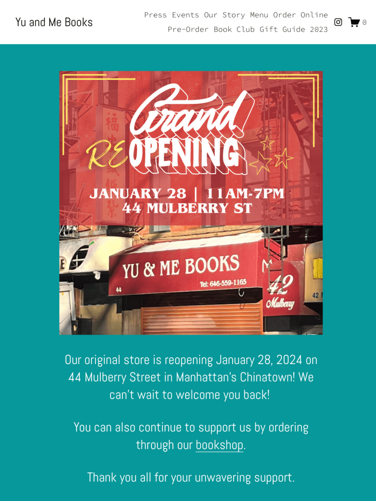
YU&ME Home Page


 Chloe Peng